


Is a picture truly worth a thousand words? Given a choice, would you rather read one thousand words, or look at one well-done picture?

I've been thinking about thinking lately. More precisely, I've been thinking about my thinking and how I come up with ideas and communicate them. One key insight - I frequently use rough doodles to help me clarify concepts and issues for myself, and then "pretty them up" when it's time for me to share them with others.
This year's annual summer book reviews cover four books that have helped me either hone my thinking skills by using doodles and simple drawings, or spark ideas for improving doodles or other visuals I prepare. The four books are:
- The Doodle Revolution – A good book to help you overcome any hesitation you have about doodling.
- The Back of the Napkin – A book that does a good job of linking steps in a thinking process with types of doodles to help clarify the issue in question.
- The Visual Display of Quantitative Information – A gorgeous book, that both looks good and explains – and illustrates – techniques of good visual display.
- Resonate – A useful book when you need to deliver an effective presentation combining both logical and emotional appeal
Each book is enjoyable in its own right, and all are easy reads. In fact, for the first two books, you'd get a lot more from the books by having some colored pens and blank sheets of paper or index cards in hand and working through some of the examples yourself.
Whether or not you read any of these books, I highly recommend them as references to help get you unstuck when you've hit a dead end in your thinking or in pulling things together more formally.
The Doodle Revolution: Unlock the Power to Think Differently, by Sunni Brown
A good book to help you overcome any hesitation you have about doodling.
This is a good book to start exploring the "a picture is worth a thousand words" idea. In Chapter One, Sunni takes aim at the "What, you want me to doodle? I can't draw!" mental block. She makes it clear she does NOT want you to draw, since a drawing that is too pretty or too ornate can actually take away from its effectiveness.
For me, the meat of the book was in these sections:
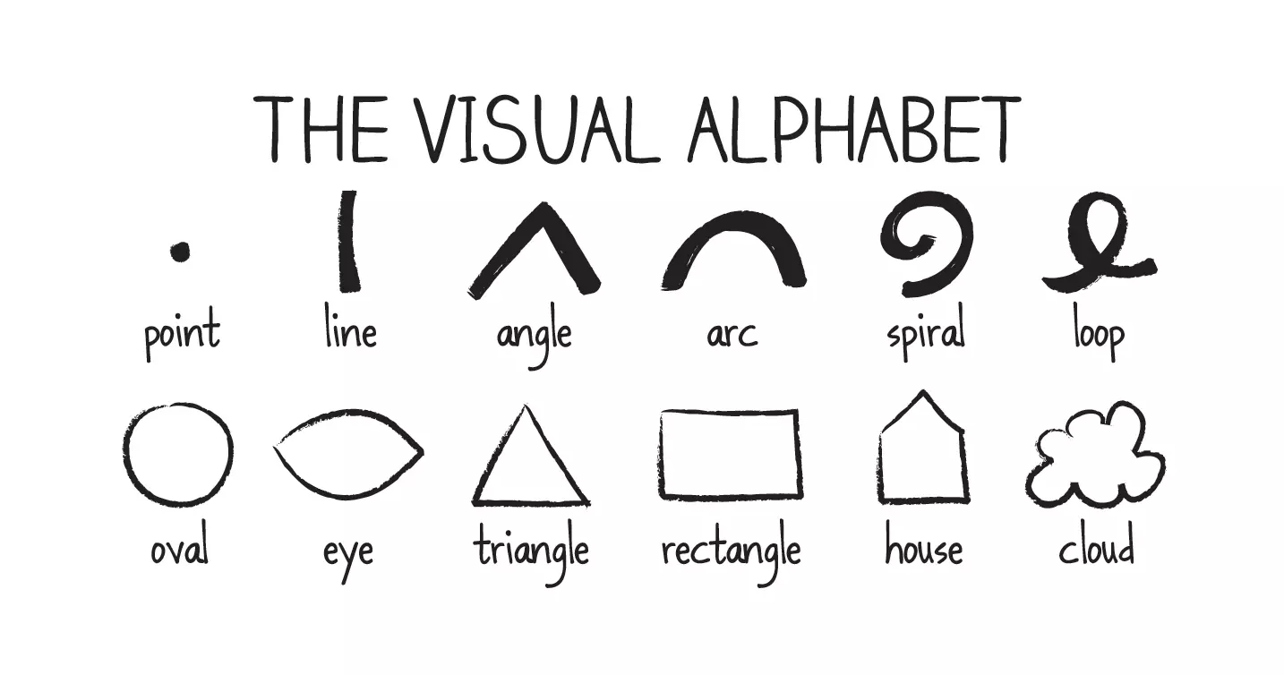
- "The Visual Alphabet" (pages 47-58), where the author goes over 12 simple marks or figures ANYONE can draw, then demonstrates how to de-compose an object you see into these building blocks and translate it into a basic doodle.
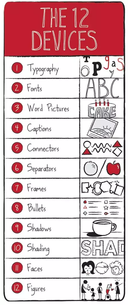
- "Enter the Infodoodle: 12 Devices That Form the Basis of Revolutionary Visual Displays" (pages 83-100), where Sunni shows how to use these to add visual interest to your doodles.
- "Infodoodling: The Art of Subtraction" (pages 101-123), that actually consists of three topics laying out:
- The need for subtraction - and especially for curation, a particular type of subtraction - because the "knowledge universe" is so large (pages 101-113).
- Tips on cutting through clutter in spoken words (pages 113-119).
- An OUTSTANDING section on cutting through clutter in written words (pages 119-123) and showing how she slashed a short article she'd written from 447 words to 102 words - a 77% reduction in length, while also improving the strength of the article!
While I found it hard to go back in this book and find specific ideas, I recommend it because of Sunni's straight-forward writing style, excellent illustrations, practical tips, and enthusiasm for her subject!
The Back of the Napkin: Solving Problems and Selling Ideas with Pictures (Expanded Edition), by Dan Roam
A book that does a good job of linking steps in a thinking process with types of doodles to help clarify the issue in question.
This is a good book to read following The Doodle Revolution, because it focuses less on HOW to doodle and more on how to USE doodles as part of a visual thinking process.
Here are the concepts I found most useful:
- "The Process of Visual Thinking" (pages 35-40), introduces the author's 4 key steps, more fully developed in Chapters 4 through 7:
- Looking, comprising both collecting and screening.
- Seeing, incorporating both selecting and clumping.
- Imagining, seeing what is NOT there.
- Showing, and making it all clear to yourself or others.
- "The Visual Thinking Codex" (pages 131-136), is the key framework for visual thinking, which Dan describes as "a master list of problem-solving pictures" and applies it to a project management situation.
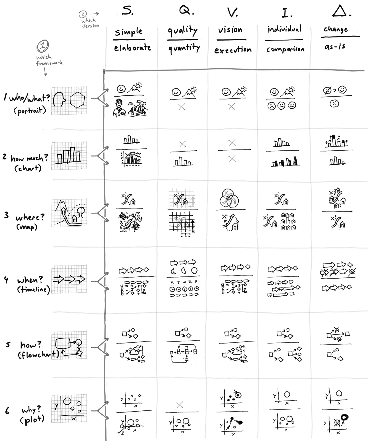
- "Part III, Developing Ideas: The Visual Thinking MBA"(pages 137-228) spans Chapters 8 through 14, taking a business scenario (not unlike a case study in MBA school) and then working through the entire process of Looking, Seeing, Imagining, and Showing, using a series of diagrams that build upon themselves.
While I found the "Visual Thinking Codex" overwhelming and fairly redundant – after all, there are a number of cells in the table where doodles in the same cell or adjacent cells are the same - this is still a very useful book to help you understand how to apply doodles and visual thinking to your problem-solving process.
The Visual Display of Quantitative Information (Second Edition), by Edward R. Tufte
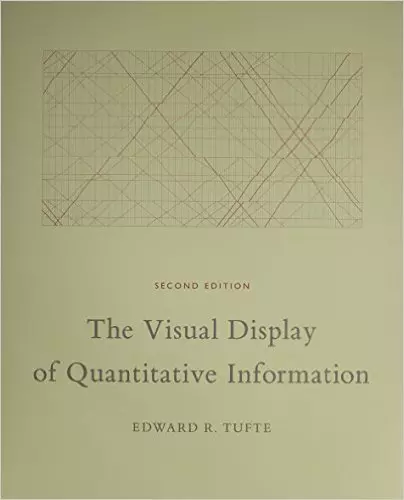
A gorgeous book, that both looks good and explains – and illustrates – techniques of good visual display.
While the beautiful illustrations make this a good "coffee table" book, it's far more than that! I view this as a "catalog" illustrating good and poor uses of visual design for quantifiable data. Along the way, the author lays out his principles for excellence in such visual designs, and critiques a number of poor examples and even redesigns a few of these into much better versions.
I first flipped through this book around 1985 (the first edition was published in 1983) when I was working in Arthur Andersen's worldwide audit software research and development group. The visual that captivated me back then was this one, drawn in 1869 by a French engineer, Charles Joseph Minard. It shows the fate of Napoleon's army in Russia (page 41).
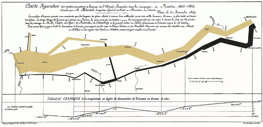
The width of the tan and black bands illustrates the number of Napoleon's men advancing to (tan band), and then retreating from (black band), Moscow in 1812 and 1813, and the route taken. The bottom quarter charts, for key dates, the temperature in degrees BELOW ZERO during the army's retreat.
The author described it as follows - "It may well be the best statistical graph every drawn." I agree.
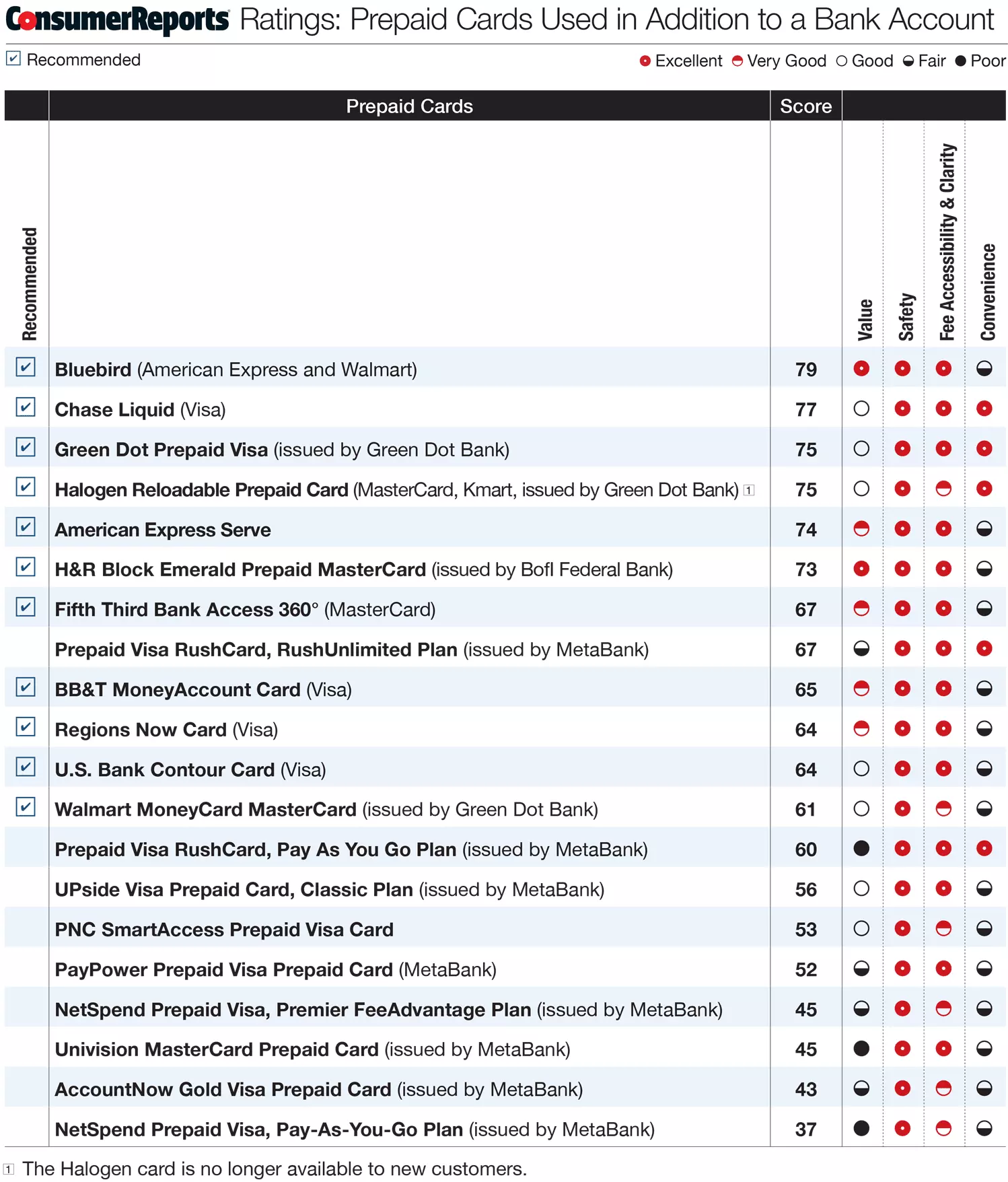
Here's another example - from Consumer Reports - of the type of effective visuals the author likes ...
... while he refers to the following visual as perhaps "the worst graphic ever to find its way into print" (page 118) ...
... because it uses SO MUCH ink to convey SO LITTLE information.
Throughout the book, the author lists various principles of graphical excellence, graphical integrity, and the theory of data graphics and effective design - techniques to create effective visual displays of quantitative information.
Here are some principles I found especially helpful:
- Graphical excellence is the well-designed presentation of interesting data - a matter of substance, of statistics, and of design.
- Graphical excellence consists of complex ideas communicated with clarity, precision, and efficiency.
- Graphical excellence is that which gives to the viewer the greatest number of ideas in the shortest time with the least ink in the smallest space.
- Show data variation, not design variation.
- Erase non-data-ink.
- Erase redundant data-ink.
- Revise and edit.
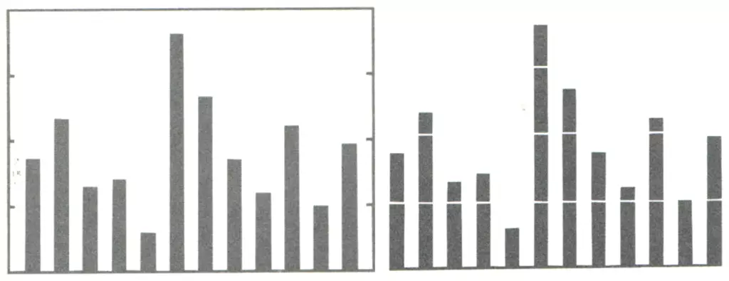
To demonstrate how these principles can be applied to the redesign of a standard bar chart, the author shows the steps he took (pages 126-128) to go from the starting point (on the left) to his finished product (on the right).
While I wish the book had laid out its design principles more consistently and made them easier to find and use, this is a small quibble of an otherwise excellent book.
Resonate: Present Visual Stores That Transform Audiences, by Nancy Duarte.
A useful book when you need to deliver an effective presentation combining both logical and emotional appeal.
In this book, Nancy Duarte outlines the methods she developed, and that her team follows in working with clients, to develop presentations to effectively engage - and persuade - the intended audience.
Throughout the book, Nancy lays out the principles – “Resonance Rules” – underlying the "Resonate" framework.
- Rule 1 - Resonance causes change. (page 23)
- Rule 2 - Incorporating story into presentations has an exponential effect on outcomes. (page 53)
- Rule 3 - If a presenter knows the audience's resonant frequency and tunes to that, the audience will move. (page 73)
- Rule 4 - Every audience will persist in a state of rest unless compelled to change. (page 95)
- Rule 5 - Use the big idea to filter out all frequencies other than the resonant frequency. (page 123)
- Rule 6 - Structure is greater than the sum of its parts. (page 145)
- Rule 7 - Memorable moments are repeated and retransmitted so they cover longer distances. (page 167)
- Rule 8 - Audience interest is directly proportionate to the presenter's presentation. (page 191)
- Rule 9 - Your imagination can create a reality. -- James Cameron (page 233)
I view the first six chapters as "setting the stage," while Chapters 7 and 8 focus on developing a presentation. Chapter 9 consists mainly of thoughts on applying the Resonate framework and two case studies on effective presentations, and the book closes with a Coda consisting of three final case studies.
With the principles behind her, the author moves on to specifics about the presentation process itself. I found the following two topics particularly helpful:
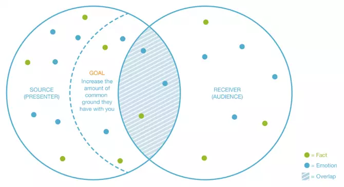
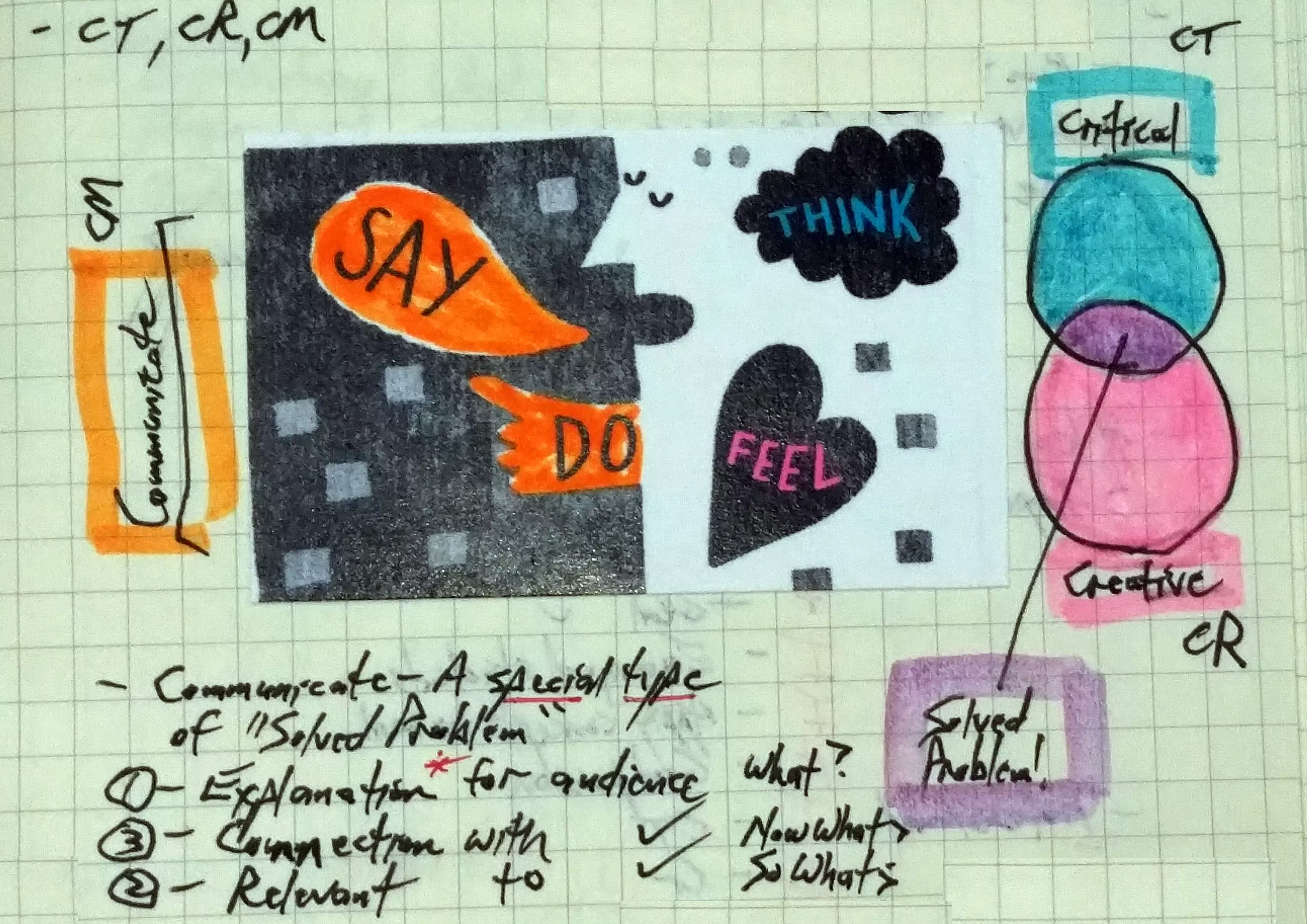
- Communicate from the Overlap (pages 70-72) – One challenge I have in presentations is combining facts - my natural tendency - with emotions. This Venn Diagram (page 71) illustrates the need for both a mix of facts and emotions shared by the presenter and the audience. The goal is to find more common ground and thus increase the overlap of the circles.
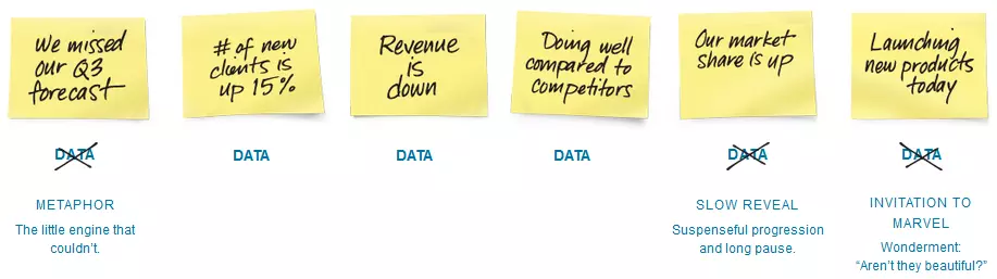
- Contrast Analytical and Emotional Content (pages 134 and 135) - Once an appropriate structure is defined, look for ways to create emotional contrast with the analytical content – for example, by using metaphors or dramatic pauses to help bring the facts to life.
The author presents - late in the book - a visual roadmap of her overall process (pages 142 and 143) that I believe would have been better placed near the beginning. Because it makes finding key techniques so easy, I've flagged this diagram for the next time I need to find something.
While not a book I'd use every day, this is nonetheless a valuable one to have available when the need arises.
So, back to the question that opened this e-newsletter ...
Is a picture truly worth a thousand words?
Through the techniques described in these books, and the visuals the authors created to present them, I hope I've helped any doubters move from answering "No" to answering "Yes."
Despite the usefulness of these four books in helping come up with ideas and ways to effectively illustrate and present them, I still wish there were one book that better - and more explicitly - covered the topics of ...
- Critical Thinking (CT)
- Creative Thinking (CR)
- Communication (CM)
... that I visualize as ...
Maybe a book like that is a worthy project for me to tackle!
Sincerely,
![]()
Todd L. Herman